#Awesomegraphs7
Teaching hybrid during the COVID19 pandemic is intense. In addition to the daily heavy weight of managing multiple tech software and hardware devices to try and offer as equitable and quality lessons as possible, as a math teacher I feel a responsibility to help students understand the how data is impacting our response to the virus.
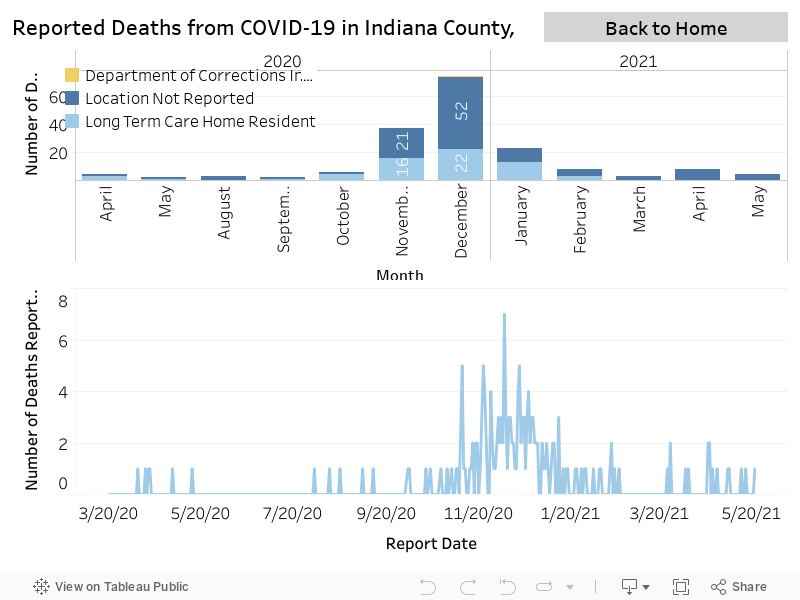
A go-to source for local COVID19 data is my #awesomegraphs7.

Last fall, she was a guest speaker for my Integrated III class, where she let my seniors know of some high school math that will help them understand the pandemic. This included exponential growth.
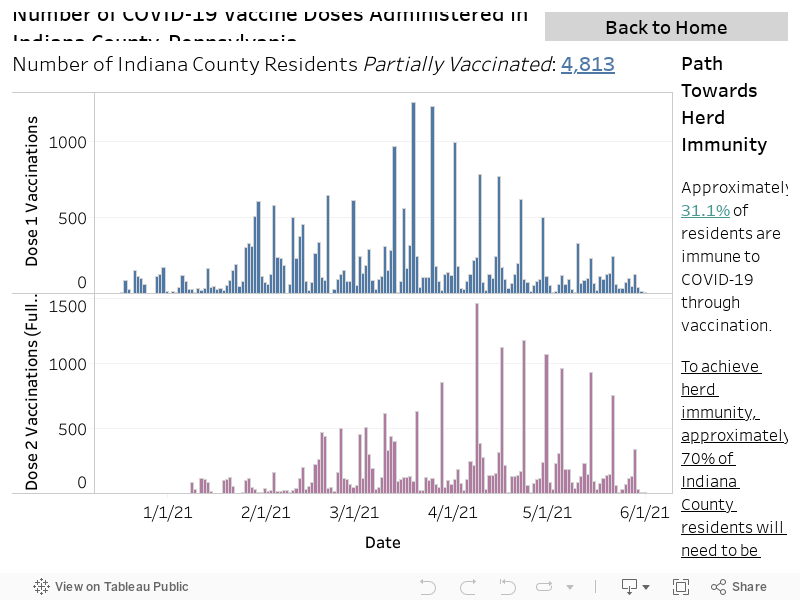
Her most recent update is much cheerier data.
What do you Notice? What do you Wonder?